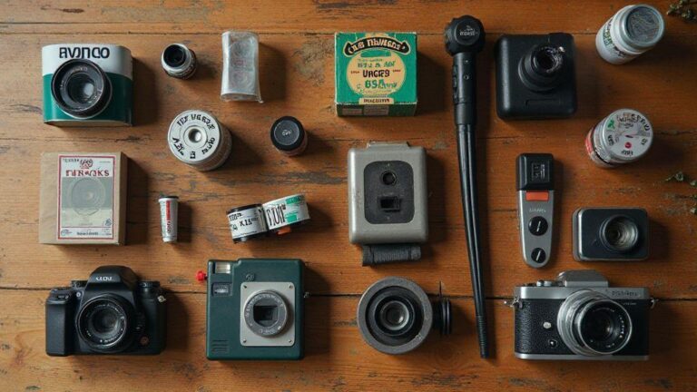

Comparing Color Negative vs Slide Films for Analog ResultsAnúncio
This guide compares color negative and slide films for analog results, focusing on exposure latitude, highlight detail, color rendition, grain, scanning, and printing. It helps you decide how to balance safe exposure with bold highlights, and how to approach workflow across different stock and processing choices.
Negative film exposure latitude vs slide highlight detail
Negative film offers a broad safety net: you can push or pull exposure and still recover detail in shadows and midtones. This latitude is invaluable in scenes with high dynamic range, like backlit portraits or bright skies behind a dark subject. However, underexposing too much will lose highlight information, and overexposing too much can flatten contrast and wash out skin tones. Negative film balances recoverable shadows against potential loss of highlight nuance, especially with bright speculars.
Slide film emphasizes highlight precision: it can hold bright areas well, but clipping can occur if you exceed the exposure, often appearing as pure white with no texture in skies, chrome, or other bright reflections. Slide film delivers punchy color and crisp highlights, but its upper-end latitude is narrower. If you’re chasing maximum highlight detail in high-contrast scenes, you’ll feel slide film’s clipping risk more acutely. Your choice Shapes not just the image, but how you tell your story: safe recovery and broad latitude (negative) versus bold highlight precision with less wiggle room (slide).
In practice, let your workflow reflect this: for scenes with mixed light, you’ll likely prefer the forgiving nature of negative film and plan to push or pull in development to preserve texture. For dramatic light ranges with bright highlights, slide film can deliver that sharp look—just don’t push it past its limits. The goal is to keep enough detail in both shadows and highlights so your final print or scan feels alive.
Negative film exposure latitude explained for you
Negative film offers wide breathing room in exposure: you can underexpose a bit to pull detail from shadows or overexpose slightly to preserve skin tones. The trade-off is potential flattening of shadows if you underexpose too far, or muted contrast if you overexpose, since the film handles highlights more forgivingly than crisp color reproduction. Know your stock, as some forums show softer shadows while others deliver punchier midtones. With practice, you’ll learn when to push or pull and how development can reclaim or preserve contrast.
Negative films tend to record smoother tonal transitions, which helps during scanning or printing because you can sculpt contrast later without chasing hard edges. In scenes with bright highlights and dark shadows, you’re less likely to cap one side—the negative stock holds detail in the gloom while keeping highlights legible. This forgiving nature is why many photographers rely on negative film for casual work and tricky lighting.
Slide film highlight detail and clipping risk
Slide film aims for precise exposure since the image is the final positive. Highlights can clip quickly if you overshoot, leaving textureless white areas in skies or reflective surfaces. The upside is vivid, three-dimensional highlights with clean, punchy look. The risk is limited recoverability in post, unlike negative film. Many shoot for highlights first, then protect shadows as a compromise exposure. When balanced well, you get the iconic bright skies and crisp greens slide stock is known for.
Clipping appears as blown-out skies or chrome that loses texture because editing software can’t easily recover it. To prevent this, meter carefully—keep the brightest areas just below clipping while relying on your metering and development workflow to maintain the look you want. If your subject has many highlight-rich elements—sunlit water, beach glare, glossy surfaces—slide film rewards color and clarity but has definite exposure limits.
Metering tips to protect highlights
- Meter for the brightest area you’re willing to lose with confidence, choosing a representative midtone area rather than pure white or black.
- For slide film, bias exposure downward slightly to preserve texture in highlights.
- For negative film, meter for a midtone and use its latitude to recover shadows in printing or scanning.
- Consider exposure compensation based on stock: slight negative compensation for slide film, a touch of overexposure for negative film to protect shadows.
- In high-contrast scenes, bracket or use fill light to balance exposure.
Slide film color rendition and saturation
Slide film yields bright, punchy colors with strong fidelity and a clean look, often with less overall contrast than you might expect in prints. Colors feel immediate and true to life, with predictable shifts that support planning your shot. Saturation stays high within a balanced range, delivering crisp color where detail holds in both shadows and highlights. If you want a clean, gallery-style look, slide film supports that clarity and reduces post-processing color fixes.
In everyday shooting, skin tones feel natural but slightly enhanced, with color contrast remaining controlled. Slide stock tends to resist unusual color casts, helping you maintain a reliable, fixed palette across varied lighting.
How slide film color rendition affects mood
Punchy colors make scenes feel energetic and uplifting—sunsets, bright street scenes, and autumn foliage gain immediacy, like wearing sunglasses that sharpen perception. For a cooler, restrained vibe, slide film can be calm and confident when lighting is carefully managed, avoiding odd casts. In dramatic scenes, the high color fidelity amplifies tension, sharpening the moment and aiding storytelling.
Slide film contrast saturation vs negative prints
Slide film offers built-in clarity with punchy contrast and bright saturation, keeping highlights legible while preserving shadows. Negative prints often require some post- or print-work to reach the same impact, granting more latitude for color grading.
Choose what suits your project: bold, ready-to-display slides or flexible negatives.
Pick film stock to reach your color goal
To hit a specific palette, pick stocks known for that balance—bright, saturated colors with clean skin tones, or deeper shadows with cooler bias. Match your stock to lighting and subject: outdoors in sun, select stocks that resist washing out; indoors with mixed light, pick those that preserve skin tones across varied white balances. Let the stock define the mood before you press the shutter.
Color negative dynamic range and shadow detail
Color negative film has a distinct shadow behavior, often holding more usable data across dark tones but potentially shifting in deepest shadows if underexposed. This broader, gentler roll-off helps when scanning or printing at lower contrast. If you want punchy black shadows, you can push or dodge, but color negative provides a safer, more forgiving safety net for detail.
Compared with other film types, color negative offers a versatile shadow range that suits portraits and street scenes where you want dimension without harsh blocks of black. If shadows look muddy, check exposure and development. Recalibrating exposure and development can keep shadows readable while preserving mood. Scanning and printing also influence shadow translation, so adjust post-process curves to preserve detail you captured.
Color negative shadows don’t scream contrast out of the gate; they reveal depth softly, ideal for natural-looking scenes. If you want more texture in dark areas, practice with exposure and development to dial in the look you want.
Why color negative dynamic range helps your shadows
Color negative films give a safety net for shadow detail, offering smoother texture recovery in dark zones, which helps you pull information from tricky lighting. More data means easier scanning and printing without turning the image into noise or color shifts. The forgiving nature helps you chase a cinematic feel without losing real-world vibe.
Overexposure can protect highlights while preserving shadow range, and midtone separation tends to stay balanced across varied light. The gentle dynamic range lets you sculpt mood in the shadows while keeping color faithful. Scanning is more forgiving, with software capable of pulling detail with fewer artifacts, speeding your workflow.
Scanning choices that recover shadow detail
- For color negatives, scan with a gentle curve that respects latitude and avoids aggressive contrast.
- Start neutral, then adjust exposure gradually to preserve texture and color relationships in dark areas.
- If possible, scan at higher bit depth for more room to pull detail without degradation.
- Test multiple frames from a roll to gauge consistency across shadows.
Calibration targets and film-specific color profiles improve color in shadows, preventing muddy tones. Maintain baseline references to learn which tweaks reliably preserve texture.
Scanning and printability of color negative and slide
Color negatives offer great exposure latitude suitable for printing, allowing shadows to be pulled and highlights recovered during scanning. Slide films, designed for projection, require careful exposure to preserve vibrant hues. Set up scanning with broad dynamic range for negatives, or a more contrasty profile for slides to maintain punch. In printing, negatives often render softer shadows and richer midtones; slides print with higher contrast and saturation. Test a few frames from each type to dial in settings for your target printer or monitor.
For scanning, balance color to match print paper: negatives respond well to a neutral color balance, slides benefit from profiles that preserve original hues. Paper choice and print workflow influence final tone: negatives often yield smoother gradients, slides higher contrast. Approach each film type with its strengths to avoid forcing one path onto both.
If sharing scans online, negatives scanned at higher bit depth retain shadow detail for web displays, while slide scans look striking in bright viewing conditions. Know your end goal—archival file, gallery print, or casual post—and tailor scanning and printing to that outcome.
Scanning negative versus slide film for best scans
Treat negatives and slides as separate projects. For negatives, start with 16-bit or higher scans to capture the wide tone range; use a neutral profile and adjust tonal curves in post to recover detail. Correct color cast in post rather than over-saturating the scan. For slides, aim for a direct scan that preserves saturation and color accuracy; keep contrast and saturation modest until you view results on a calibrated monitor. Negatives tolerate more exposure flexibility; slides reward precise exposure and clean highlights.
Printability of color negative and slide on paper
Prints from color negatives are forgiving with smoother gradients and better shadow detail on standard color papers; you’ll likely need less aggressive print adjustments. Slides can pop with brightness on paper, but choose papers that support higher contrast. Slightly cooler or neutral papers help balance vibrant slide colors without distorting skin tones. Paper type (gloss, luster, matte) changes the final feel, so pick one suited to your mood and viewing conditions.
If you’re sending work to a lab, request standard color correction for negatives and a color-balance check for slides, plus proof prints if offered. Specify output size and paper type, and ensure lab color management is calibrated. This reduces surprises and helps prints stay true to scans.
File settings and lab options for clean prints
Use a high-quality TIFF or RAW-derived workflow with consistent color space (e.g., sRGB for web, wide-gamut for prints). Label files clearly to avoid mix-ups. Include notes on color balance and gentle brightness adjustments, but avoid heavy edits that confuse labs. If proofing is available, take it.
Choose labs that explicitly support analog film scans with calibrated equipment. At home, use color-managed workflows with calibration targets and soft-proofing. Align printer settings with your paper choice (coatings, ICC profiles, brightness). Treat your film as a project with a chosen final path for reliable results.
Creative techniques and cross processing E6 C41
Cross processing between E6 (slide) and C41 (color negative) can boost textures and color in surprising ways, creating bold contrasts and cinematic vibes. Pushing slides through different chemistry yields unexpected color shifts, punchier blacks, and a sense of immediacy. Treat each roll as a new palette rather than a fixed recipe, balancing mood while nudging color language to tell a stronger story.
Practical cross processing involves careful timing, temperature, and agitation. Keep clear notes on stock, developer temperatures, and soak times. Small changes can swing the look from sultry warmth to icy pop. You’ll learn to push blues toward magenta or greens toward teal without losing legibility. The goal is controlled surprise that serves mood and storytelling.
Cross processing isn’t about copying someone else’s look; it’s about crafting your own. When you combine E6 slides with a C41 developer, you mix worlds—like a familiar song with a new tempo. Expect intentional color shifts that define a moment without shouting. Note results, test small, and let the process become part of your creative voice.
Cross processing E6 C41 effects you can use
- Gradients bend unexpectedly, with skin tones carrying a soft, sunlit glow.
- Saturation can be pushed selectively for punchy reds or teal shadows.
- Grain textures shift—sometimes finer, sometimes coarser—adding tactile depth.
- Contrast can become more dramatic, with deeper shadows and lively midtones.
- Transitions between lights and darks gain a velvety feel, lending a cinematic quality.
- Glows or halos around bright elements can separate subjects from backgrounds; keep it from washing out skin tones.
When to choose slide or negative for a look
You’ll often face a choice: slide (E6) for punchy, saturated color and immediacy, or negative (C41) for flexibility and forgiving tone range. For bright colors and high-energy mood, slide delivers a direct, high-density color you can’t easily emulate with negatives. It’s ideal for fashion, urban nights, or any moment you want to feel charged.
If you need flexibility and smoother tonal range, negatives are your friend. They offer more latitude in post, easier skin tones, and less risk of blown highlights while testing different looks. Negative film handles mixed lighting well, making it easier to recover details after the fact. In short: choose slide for intensity; choose negative for breathing room and refinement.
Simple tests to reproduce consistent results
- Start with a small test batch: one roll of slide and one roll of negative, exposed the same way.
- Use identical lighting, subjects, and metering; compare color shifts after cross-processing and note times, temperatures, and agitation.
- Track results with a simple log: stock, developer, time, temp, quirks.
- Run a second test varying one variable at a time (temperature, exposure, cross-step timing) to isolate effects.
- Mount a quick-reference cheat sheet in your workspace with stock, fix times, and starting points for each cross-process pairing.
- Over time, you’ll dial in a stable, repeatable look you can call your signature.
If you’re deciding between negative and slide for a look, this guide supports practical choices aligned with the goal of Comparing Color Negative vs Slide Films for Analog Results. By understanding exposure latitude, highlight handling, color rendition, and scanning/printing workflows, you can craft consistent, expressive analog results that match your storytelling.

Junior Souza is a passionate analog photographer and the mind behind estoucurioso.com. With a camera always in hand and a roll of film never far away, Junior has spent years exploring the world through a 35mm lens — learning, experimenting, and falling deeper in love with the slow, intentional process that only analog photography can offer.
What started as pure curiosity quickly became a lifestyle. From testing different film stocks under harsh light to hunting vintage lenses at flea markets, Junior believes that understanding your tools is just as important as developing your eye.
Through estoucurioso.com, he shares everything he has learned along the way — the techniques, the mistakes, the references, and the stories behind the frames. His goal is simple: to build a space where beginners and enthusiasts alike can grow, get inspired, and never stop being curious.
Always learning. Always shooting.